
A quiz-as-a-product teardown of Growplex digital quiz journey
The website is a customer-facing digital product. A quiz is a valuable asset when it helps customers make a decision they came to the site to make.
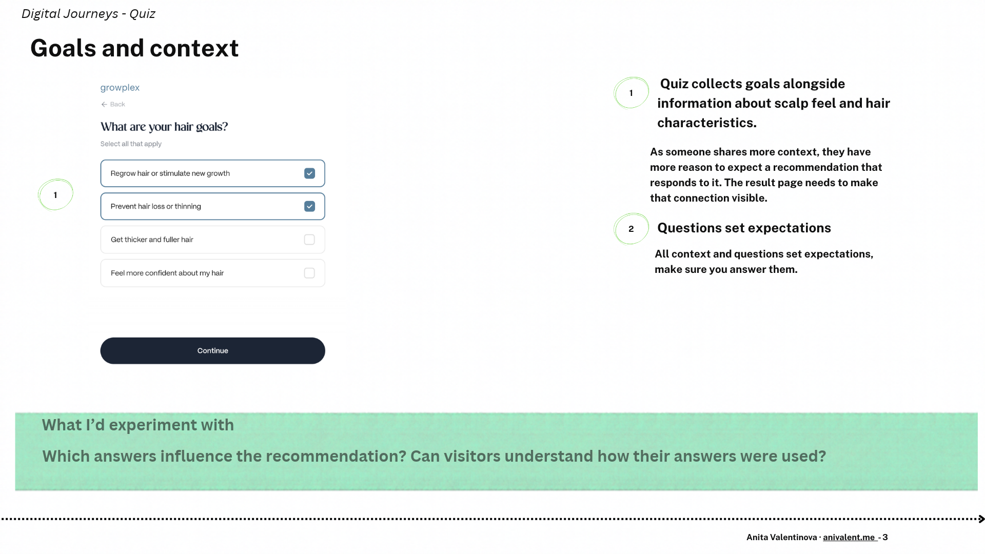
A hair-loss quiz starts with the audience and their pain points. Thinning hair? A widening part? That’s something a customer can recognise in the mirror before they know what product to look for.
That concern can shape the whole journey from click to conversion. It informs the questions the quiz asks. The answers guide the customer towards an offer. And the product page should pick up where the quiz left off and explain why the offer fits what the customer shared.
If those pieces don’t connect, the customer has to work out for themselves why they got that recommendation. That’s a point where they might drop off.
I’ll use Growplex to show how those pieces connect and what I’d test where the quiz hands over to the product page.
I wanted to see how the quiz fits into the wider journey. What does the website or campaign promise when it sends someone to the quiz? Do the questions reflect what that audience is dealing with, and do they ask enough about the person’s situation to recommend a product? Then, when the customer lands on the offer page, does the website explain why that product fits what they shared and deliver on the promise that got them to start?
1. The first answer shapes what comes next
Opening question
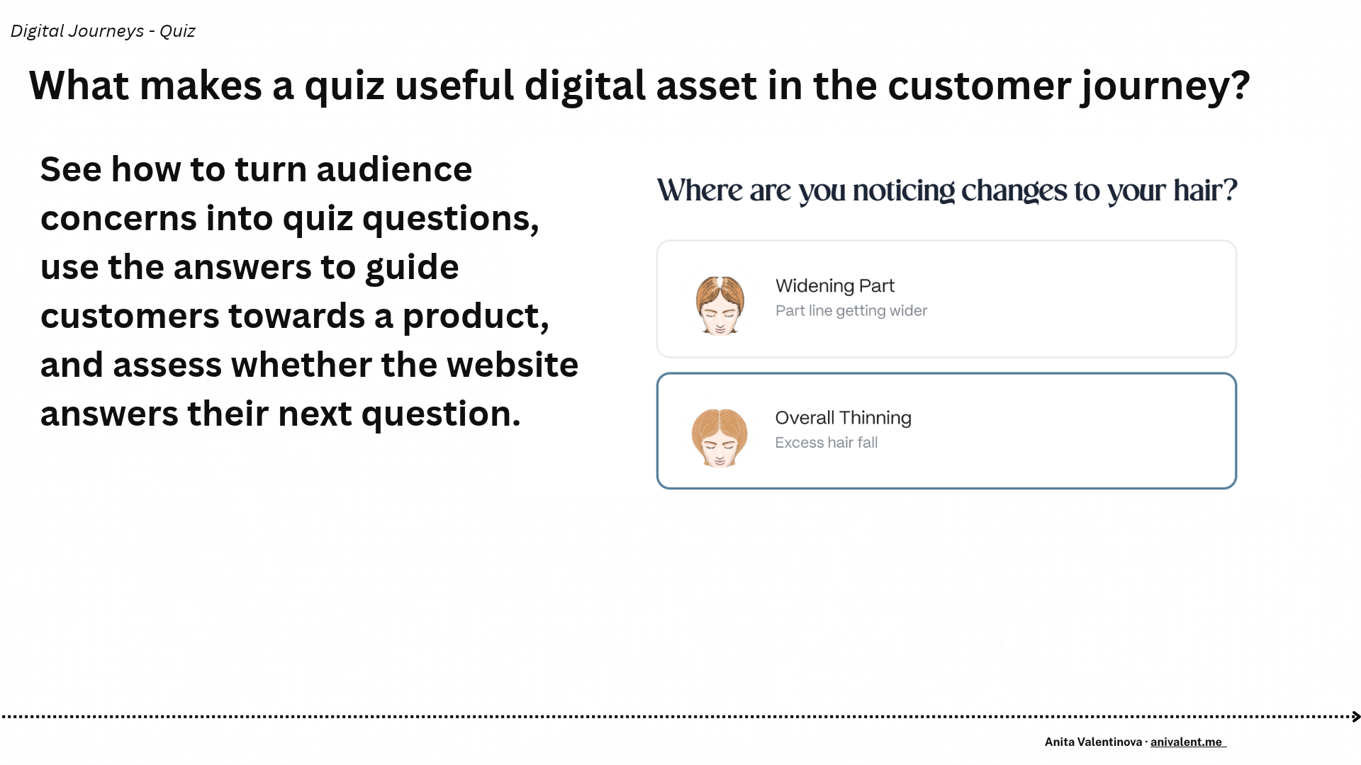
Growplex asks about biological gender before asking what’s changed. The wording on the opening screen gives little indication of why it’s asking, but the next step gives the answer a job. The female path shows options such as a widening part and more visible scalp.
Add a short line under the opening question explaining that the answer helps tailor the next set of options. I’d look at first-step continuation and ask people whether the reason for the question was clear.
2. Give people a way to recognise their concern
Hair change options on female path
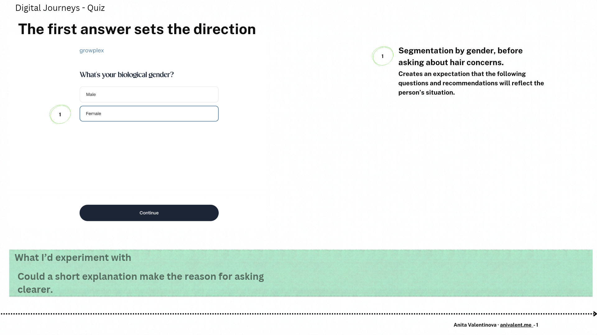
This is the strongest screen for me. Someone can picture it, compare it with what they’ve seen in the mirror and decide whether it applies. That gives the visitor a way into the journey before they’ve formed a preference for a particular product.
There’s a question I’d want to answer before changing this screen. When someone notices both more shedding and a wider part, how do they decide which option best describes their situation? I’d watch a few people work through that choice and listen to how they explain it. It could be a good opportunity for another digital asset which helps the user explain their situation and reach a conclusion.
3. Each question creates an expectation
Goals and scalp-free questions
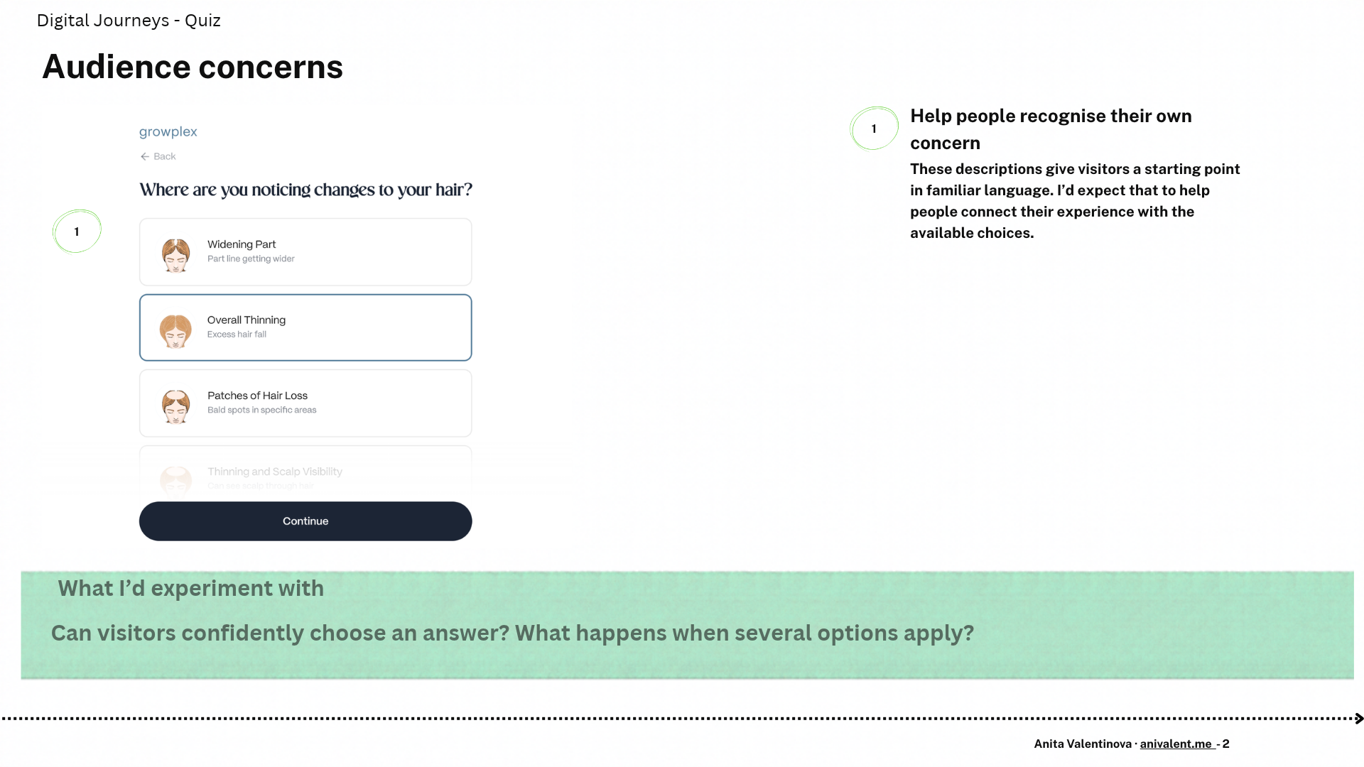
Further in, the quiz asks what people want to achieve and how their scalp feels. Those questions make the experience feel more specific. They also raise the bar for the result. After telling the brand what I’m seeing and what I want to change, I’d expect to understand how those details relate to the routine I’m shown.
I’d compare paths with one answer changed at a time. That would help me see which answers change the offer, which change the explanation and where the result stays the same.
4. Explain why this kit follows from the quiz
The kit page explicitly connects the offer to the quiz answers. That handoff is where I’d focus my first test. The headline tells the visitor that their answers led to the kit. I’d want to see whether the page can make that connection easier to understand at the moment the visitor is deciding whether to buy.
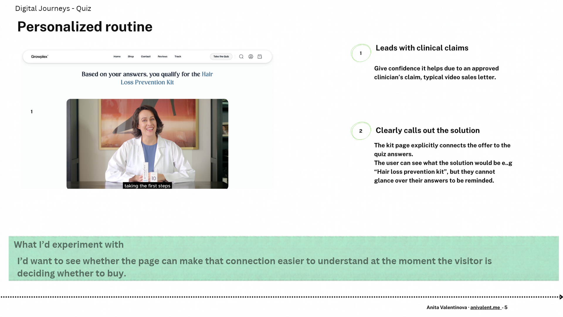
Recommended kit and product offer
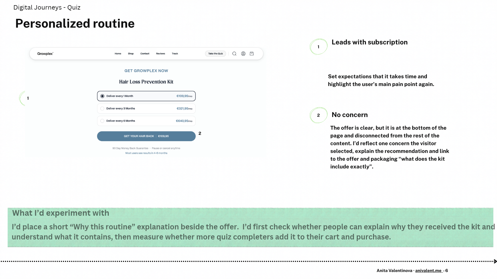
Subscription offer
What I’d test
Place a short “Why this routine” explanation beside the offer. Reflect one concern the visitor selected and explain how it informed the recommendation, using only the answers that actually drive it. I’d first check whether people can explain why they received the kit, then measure whether more quiz completers add it to their cart and purchase.
A quiz earns its place as a digital asset when it helps a customer make a decision they came to the site to make. Growplex’s hair-change screen shows what that can look like early in the journey. The offer page has the chance to carry the same specificity through to the buying decision. I’d judge improvements to the quiz by what people understand and do when they reach the offer, as well as whether they finish the quiz.
Independent teardown of the public experience and no affiliation with the brand. The test ideas are hypotheses based on my experience and walkthrough the flow. I reviewed the visible flow and offer, and would verify the recommendation logic by comparing completed paths.